AIO
aioapp.com- Web design
- Art direction
- Project management
- QA
- Team lead
Project snapshot
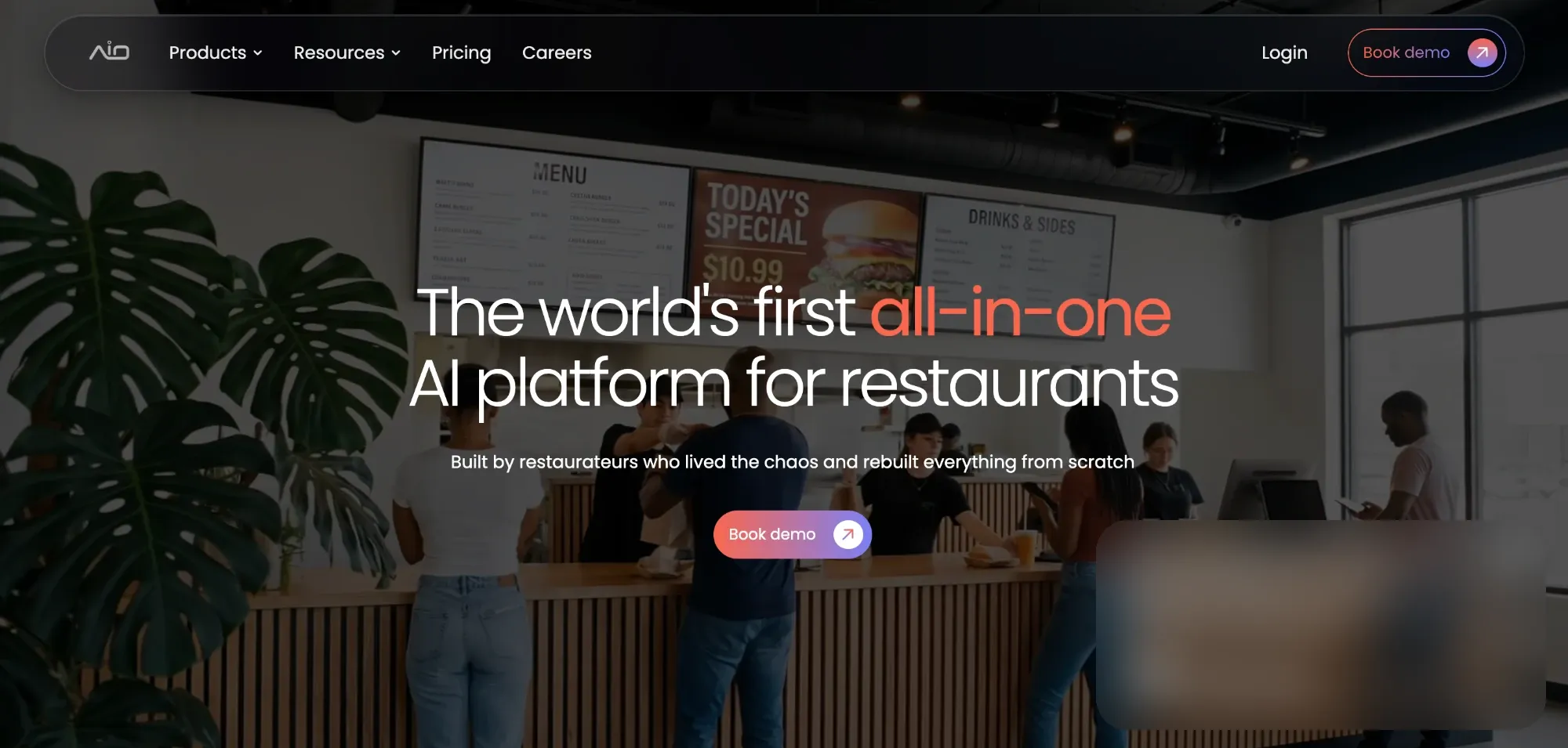
AIO is a US-based startup building an all-in-one AI platform for restaurants. It brings ordering and payments, marketing, staff management, inventory, back-office work and analytics into one system. Its customers are independent and multi-unit restaurant owners in the US.
Senior Web Design Associate, Jan 2024 – May 2026 (about 2.5 years).
I owned the marketing website end to end. Across three major versions I took it from wireframes to production. I started as the only designer, and from V2 onward I also led a junior designer. On top of design, I handled project management for the site: QA, Jira, day-to-day work with developers, and art direction for company photoshoots.
The site is still live, and apart from a redesigned blog, the whole site is still my design.
- 3major iterations of the site
- 6A six-module product whose sub-features kept growing as the product expanded
- ~200Company-wide photoshoot (~200 people) for the careers page and site imagery
- 2Two-week build/QA sprint cycle with a dev team of 2–4
The problem
Before this project, AIO had no real website, only a "join us" page. The company needed a site that could do three jobs at once:
- Convert US restaurant owners into demo bookings
- Explain a large AI product in plain, practical terms
- Build credibility with investors as well as customers, so a young company looked established and trustworthy
Constraints
- An existing palette and font. The brand colors and the font, Poppins, were already set, so I had to play around with font weight, letter spacing and sizing to make the type my own. The rest of the site's visual language was mine to define.
- A large, growing product. The six core modules were fixed from the start, but each one kept gaining features, so the content was always expanding.
- Startup pace. One version had to be designed and shipped in about three weeks.
- Stakeholder parameters. The founders had firm requirements for every version, so creative freedom was always partial.
- Build limits. The first, more ambitious direction ran into load-time problems and development bugs. From then on, I checked whether each idea could actually be built before designing it out.
Who it's for
Who: Restaurant owners in the US.
What they needed to believe: Restaurant owners didn't doubt that AI was impressive. What they wanted to know was how it would make their day easier. The site had to answer that practical question, not sell "AI" as a concept.
How that shaped the design:
- Lead with everyday operational benefits rather than technology
- Keep a very broad product digestible, so an owner isn't overwhelmed
- Use real, human imagery of restaurants and the team, so the product feels grounded and the company feels credible
Goals
- Drive demo bookings ("Book demo" is the main call to action across the site)
- Explain the platform clearly despite its breadth
- Give the company a polished, credible presence for customers and investors
How success was measured: Success was judged by stakeholder sign-off. Each version had to meet the founders' requirements before it could ship.
Design process & key decisions
I used a Miro moodboard throughout the project to develop the visual direction. Early on it was deliberately experimental and pulled in many directions. With each iteration it narrowed down until it settled on one consistent look.
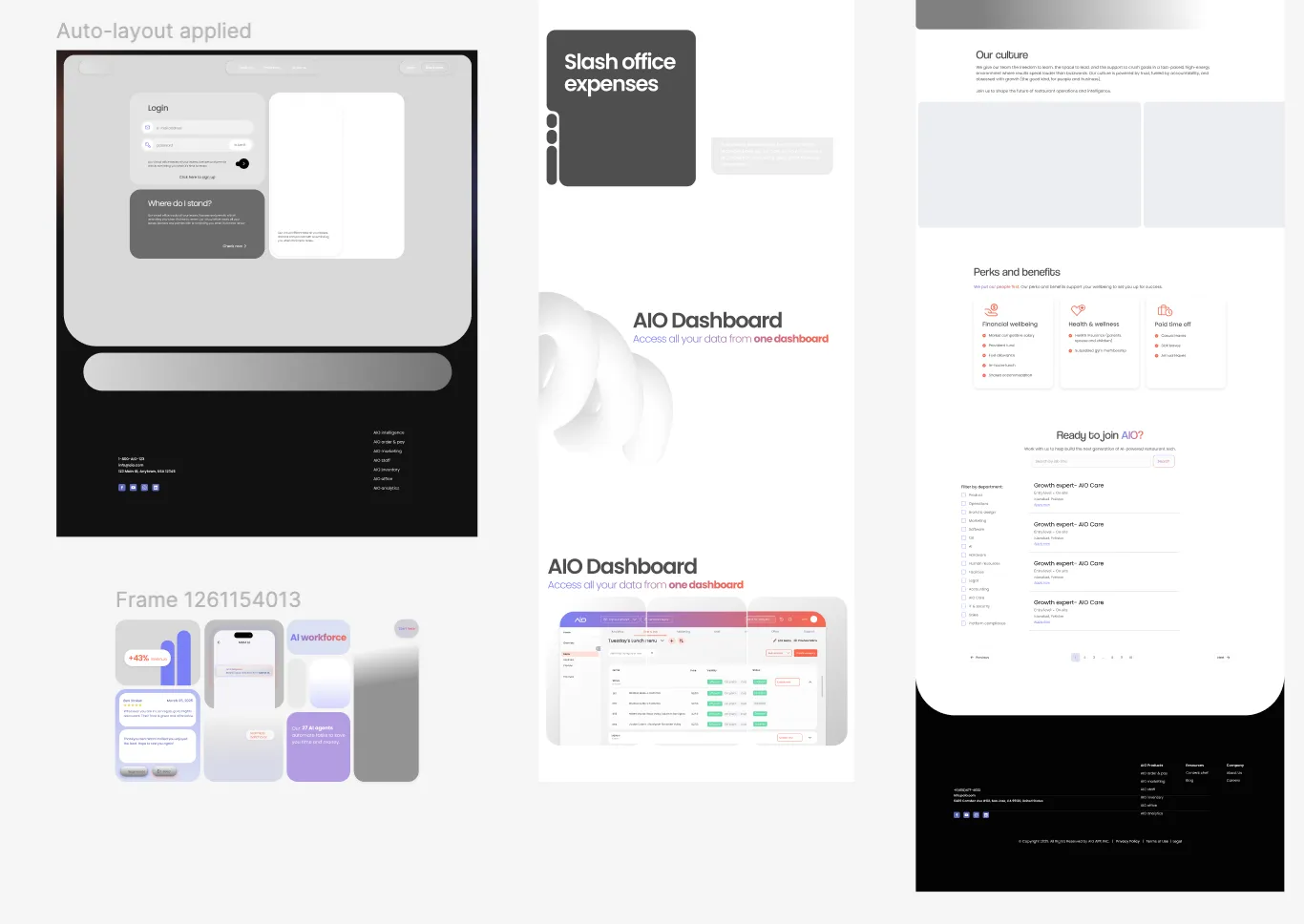
the three iterations
This was a futuristic, experimental direction. It pushed the visual language hard, but in practice it hit load-time problems and a large number of development bugs.
The biggest lesson from V1 was that ambition has to be matched by what the team can build and what performs well.
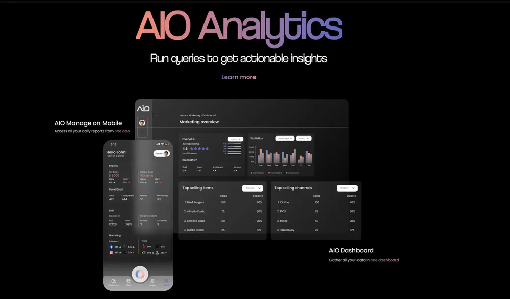
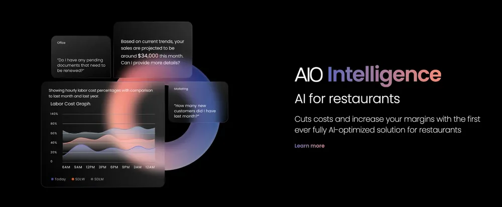
V2 was an urgent version that had to be designed and shipped in about three weeks so the company had a working site. There was little room for creative decisions here; the priority was getting a reliable site live. My junior designer joined at the start of V2.
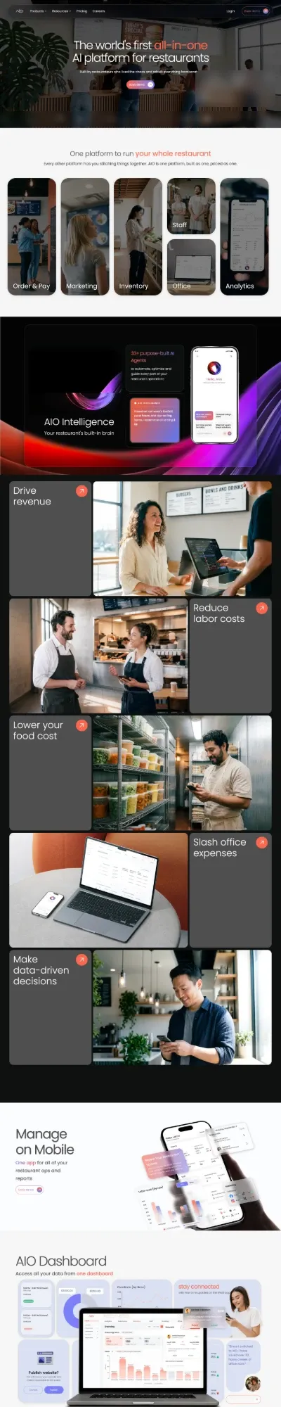
V3 took the most time and care. It went through many rounds of feedback and redesigns. Stakeholders still set parameters, but I had much more creative control than in V2. This is the version that's live today.
key decisions
The platform covers six modules, each with a growing list of features, and the founders saw all of it as important. My main job was to reduce and prioritise that content so a restaurant owner could understand the product without being overwhelmed.
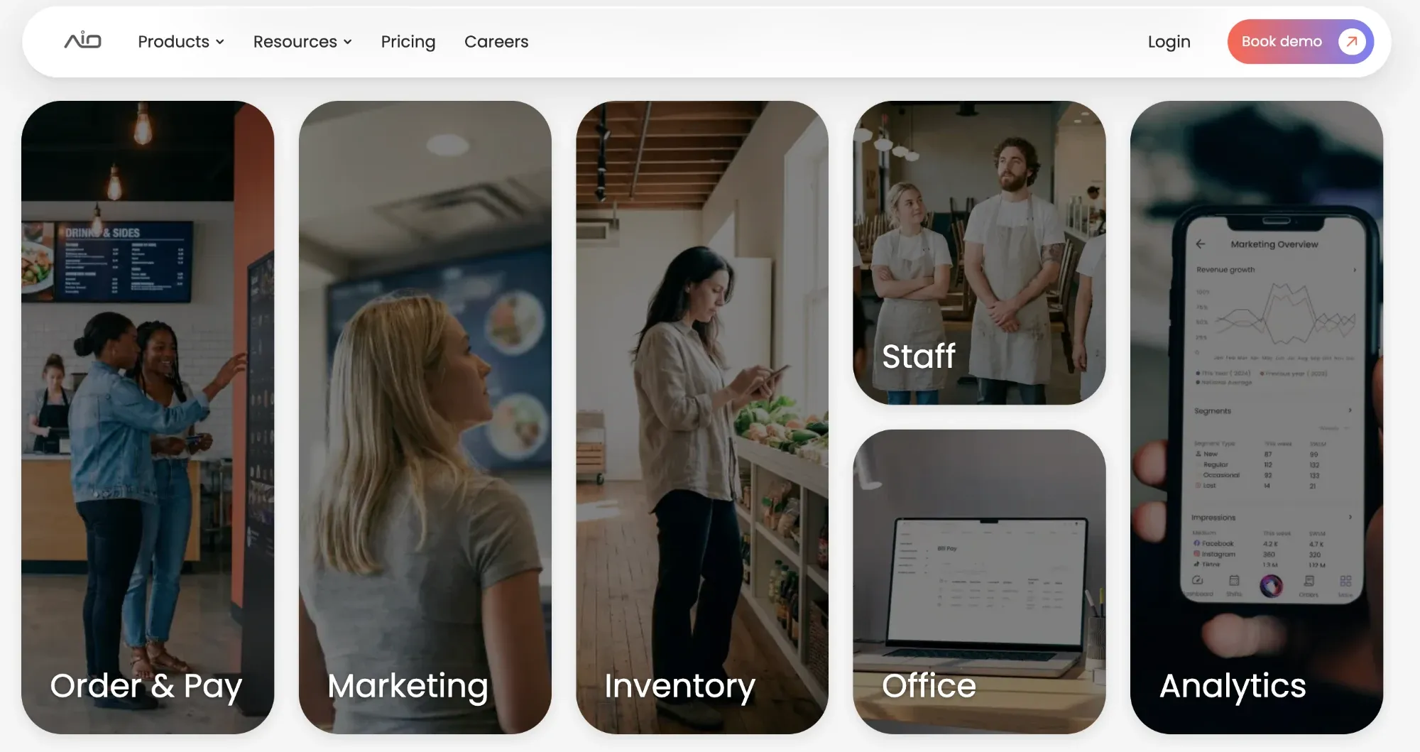
After V1, I changed how I worked with developers. Before a design went into production, I shared the concept with them so they could build a proof of concept and confirm it was achievable.
That kept V3 ambitious while avoiding a repeat of V1's performance and bug problems.
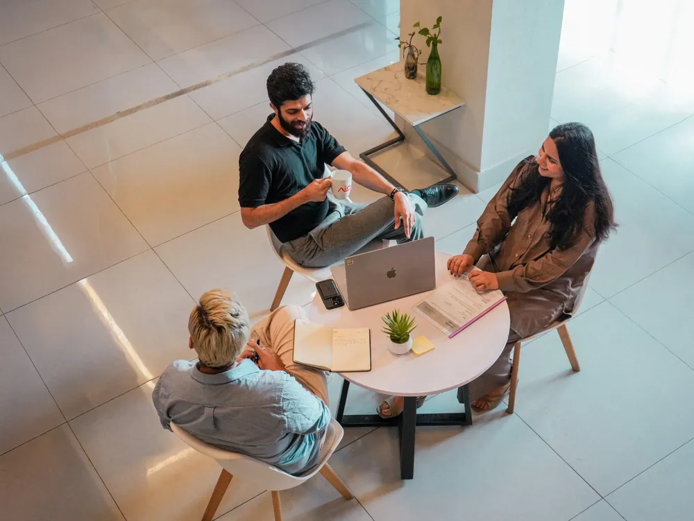
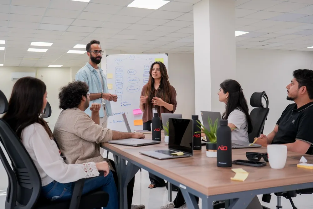
To make the site feel human and credible, I art-directed a photoshoot with the whole company (~200 people), including the imagery for the careers page.
The product wasn't yet fully functional at the time, so every scene was staged: I planned the concept, props, settings and positioning so the photos showed the product in use convincingly.
The colors and the font, Poppins, were already set, so I shaped the site's identity through how the type was used (font weight, letter spacing and sizing) and the overall visual system.
The junior designer joined at the start of V2 and took on repetitive production tasks, which freed me to focus on direction. I kept ownership of the creative direction, the design decisions and the final quality of the site.
Beyond design
I owned the website beyond design. When something wasn't right, I was the person who heard about it, so I took responsibility for the whole result.
- I shared concepts with developers before implementation so they could test feasibility with a proof of concept
- I stayed in close contact with the build team: 2–4 developers, 2 of them mostly building
- The team worked in two-week sprints: one sprint for building, the next for QA
- After each handover, I tested the build and logged every issue in Jira
- Everything was documented, so we always knew who was working on what and what had been fixed
- Repeated testing across every desktop and laptop screen size I had access to
- A high volume of detailed Jira tickets so developers had clear, specific fixes
- I directed them fully: concept, props, sets and staging
- The shoot covered the whole company (~200 people) and produced the careers page imagery
Why it matters: this work shows that I can take a design from concept through feasibility checks, development and QA to a live site, and manage the people and process in between.
Challenges
The founders saw every feature as important. Cutting content down to something restaurant owners could take in meant a lot of negotiation and several rounds of redesign during V3.
V1's futuristic direction ran into load-time problems and many bugs. I responded by changing the process: feasibility checks with developers before design went into production.
The product wasn't fully working at the time of the shoot, so every scene had to be staged to show it realistically. On top of that, I was coordinating a shoot for roughly 200 people.
Outcome
- I shipped three versions of the site, ending with V3, a considered redesign that is live today
- Apart from a redesigned blog, the current site is still my design
- I set up a repeatable way of working with developers: feasibility checks before design went into production, and two-week build/QA sprints tracked in Jira
- The company photoshoot produced the careers page imagery
- The site went from a single "join us" page to a full marketing site that explains a six-module platform and drives demo bookings
Work created during my employment at AIO. All rights belong to the company.